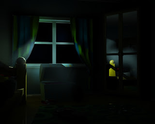
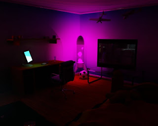
I was initially planning on just doing a little compositing scene with a monster thing attacking innocent people in a dark alley...cos I thought that would be pretty cool! :)
But after some talks I decided to go for the Director route which means making a 90 second clip instead. I wanted to keep the dark alley attack but I had to expand on the idea, which meant creating a story!
I came up with the idea of having this young boy, say age 10-12, and a demon aka the monster in the dark alley. The initial concept for the story was to have this demon following the boy as if he's hunting him, but only at the end do you realise that the demon is actually his protector, like a darker version of a "guardian angel" (Thanks Joe P)
....................
STORY
In my story I want the boy to be walking down the street at night, and in the background you see that this demon is following him across the rooftops, as if he's hunting the boy as prey. The boy walks down a dark alley and then gets mugged by a group of boys. The demon jumps in and attacks the group, but jumps away and leaves the boy unharmed to show he’s on the boys side.
I wasn’t sure how to get the ending to work to show that the demon is the boy’s friend. I thought of having the demon licking the boys face, or having the boy petting the demon as if he knew it or even owned it as a pet, but I didn’t like these ideas because I thought it was too obvious, and it just wouldn’t work with the rest of the story and that it just wouldn’t look good enough...so (with some help from my brother) I decided to have this stand off with the boy and this tall demon, and then have the demon simply jump away into the darkness, and leave the boy unharmed. I think this way it wasn't super obvious but it still told you enough information so that you know the demon is on the boy's side.
Here's a VERY rough animatic of this story concept:
....................
After making this animatic I thought to myself "this ending is really lame!"
I didn't like that the boy cowers in fear at the end because he thinks the demon's gonna attack him, but then after the demon jumps away he smiles with delight that he hasn't been mauled to death. I'm not really sure why I didn't like it...but I kinda just thought it didn't work with the rest of the story and I thought it would just be best to finish it with the stand off between the two. Throw in some dramatic escalating music and some camera distortion (Thanks Joe O'C) and you have an enigmatic ending! ...WIN!
I liked the idea of a cliff hanger ending cos then it makes the viewer think "what happens next?" and in this case it could go both ways...demon eats boy, demon doesn't eat boy...it let's the viewer decide for themselves what happens next, which I think works better for this kind of story. I think it also gets the viewers more involved with the story because it makes them ask questions about what they are watching ... and that's always good :)
....................
CHANGE OF PLAN
So...after speaking with GH he convinced me to keep what I have but he reckons it would be a good idea to turn my short film into an advert!
I'm sorry to say I was a bit iffy at first about the thought of turning this into an advert, because I liked what I had :) but after a long talk and idea throwing I was happy with turning it into an advert ... only question is: Advert for what?!
With an advert it's more acceptable for the viewer to have this demon in the world. It doesn't need to make sense because, well, it's an advert, and all types of crazy stuff happens in adverts!
Anyway...Advert...What kind of advert?
I've been doing some research and references and I've come across adverts for different types of Causes (like RSPCC, FRANK, THINK!) which I think would be pretty cool to do with my story.
So now I've decided what kind of advert to do, next step is to decide which Cause?
I thought of 3 different causes I could do:
1. Anti-Drugs
2. Domestic Violence
3. Anti-Bullying
1. With the Anti-Drugs Cause I thought that the demon could be like a metaphor or be a representation of how the drug attacks the body with chemicals and other nasty stuff. The story would change slightly, so instead of having a 10-12 year old I think with this advert it would be more appropriate to have him more like 15; and instead of having the boys come out and try and mug the boy, they'd come out and try and sell drugs to him, the boy says No! and the demon attacks the Druggies.
Oh! The advert needs a slogan aswell, so in this case, at the end of the advert it would be like ... "Don't let the drug demon get you! Say NO to drugs!" obviously with rewording cos that's not amazing but something along those lines.
2. With the Domestic Violence advert I know domestic violence refers to inside and my idea is set outside, but this advert would show how it affects the child of the fighting parents by having him see violence around him wherever he goes. In this case the demon wouldn't be real, but just part of this little boy's imagination.
The beginning scene would change, so before it shows him coming out of the house, there's a seen inside with the parents arguing violently and sounds of plates smashing. When he walks out of the house and walks through the dark alley he sees in his head this demon attacking the boys outside like he sees inside the house with his Father attacking his Mother. So in this Cause advert the demon is a representation of what the boy sees happening at home.
The slogan would be:
"You're child may leave the house, but the demon of domestic violence will never leave the child" (Thanks Fliss)
3. With the Anti-Bullying advert I thought everything from the initial animatic could be kept (with some dialogue thrown in) and have more added for the ending. With this idea, the boy gets ambushed by 2 bullies in a dark alley...the boy cries for Help! and one of the bullies says summin like "There's no one here to help you!" (better script will be added) then it goes into like a dream sequence, with the demon coming in and beating up the bullies, therefore protecting the boy from the bullies. But! at the end it goes back to "real life" and to a previous scene where the bully says to him "there's no one here to help you!" and because it's the real world again and not the boy's imagination, the boy gets beaten up by the bullies and then the slogan for the advert comes in with something like:
"Their imagination won't save them from the bullies....who will?"
I like this tagline, but again I think it needs rewording a bit.
I've noticed at the end of most of these Cause adverts there's a shocking ending which really hits the audience with the seriousness of the cause.
With my bullying advert I thought of giving it a shocking ending to impact the audience just like many other adverts have done. This way the audience will have the advert stuck in their head, and if that happens, then it's proof I've gotten through to the audience, and hopefully made them think about the cause the advert is promoting.
....................
In the end I decided to go with the Anti-Bullying advert because I felt I could do more with the story and camera shots etc. than I could do with the other adverts ... and also I just feel that my demon story works better with this advert than the others.
Here's a VERY rough animatic for my Anti-Bullying Advert:
Notes on what I could change/do differently:
- Wider camera shot with stand off...more of a scale difference between the 2 characters
- Change colour of shots to show it's a dream sequence
Now all that's done it's off to do more work I go!
